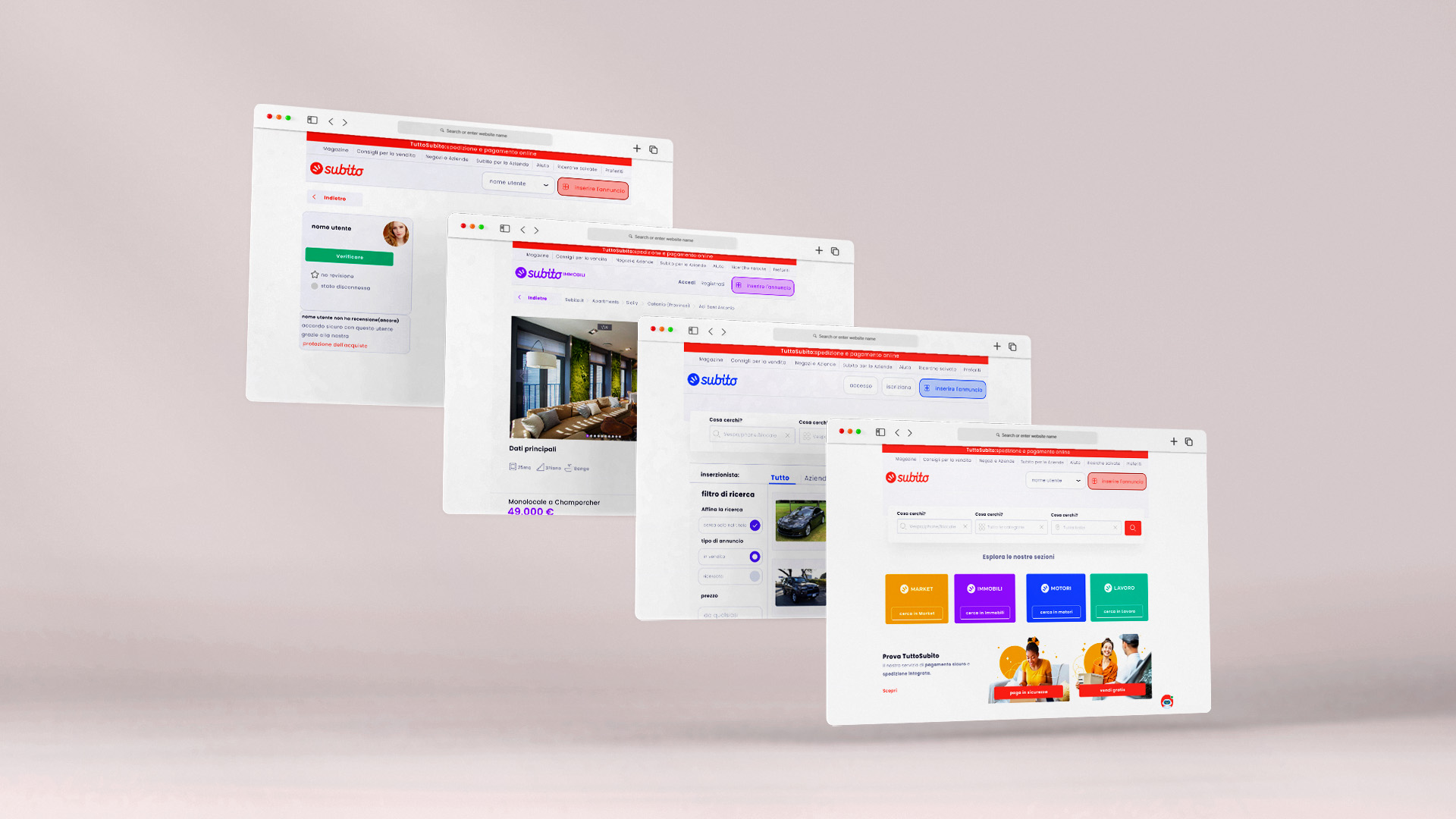
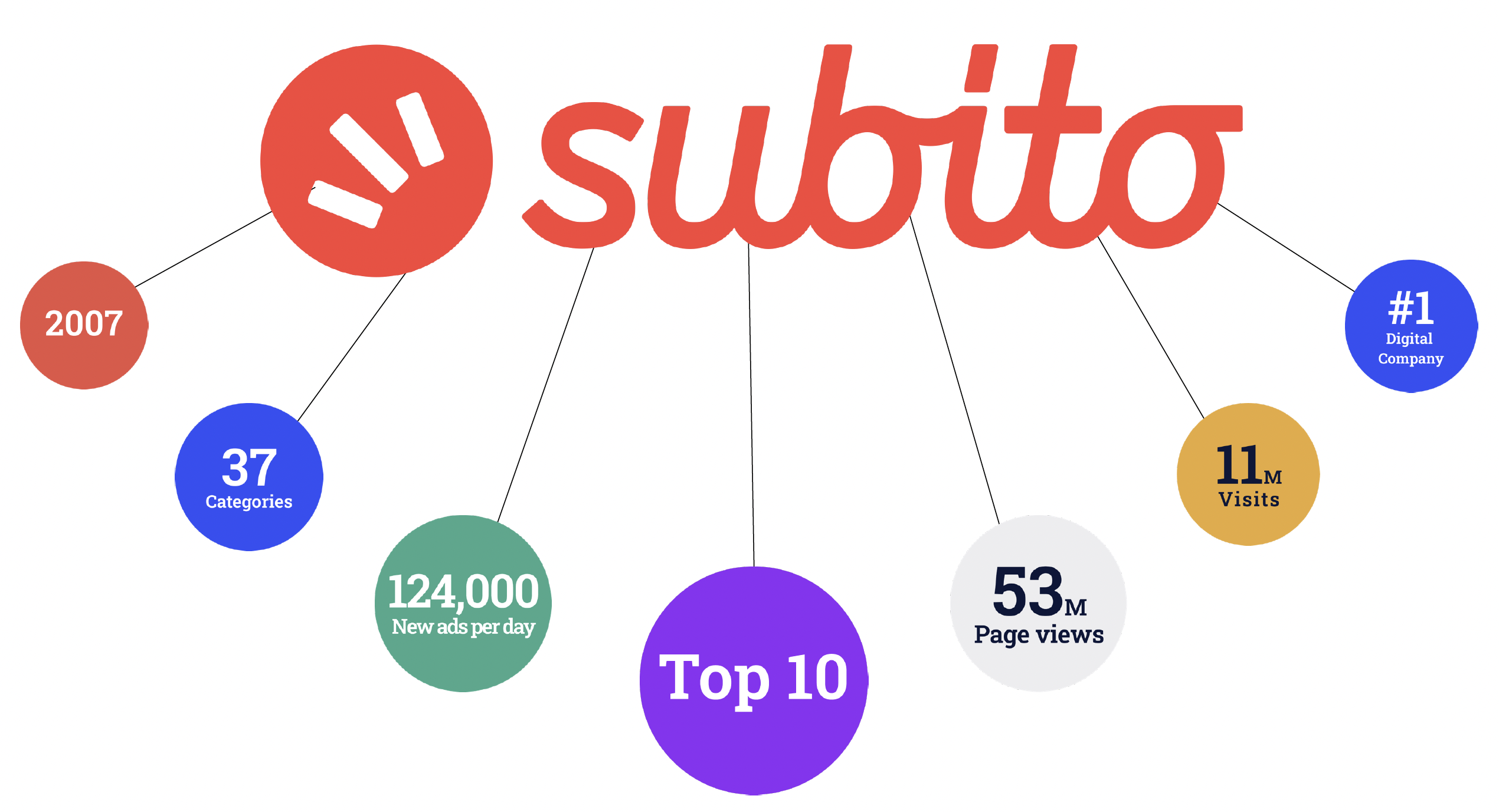
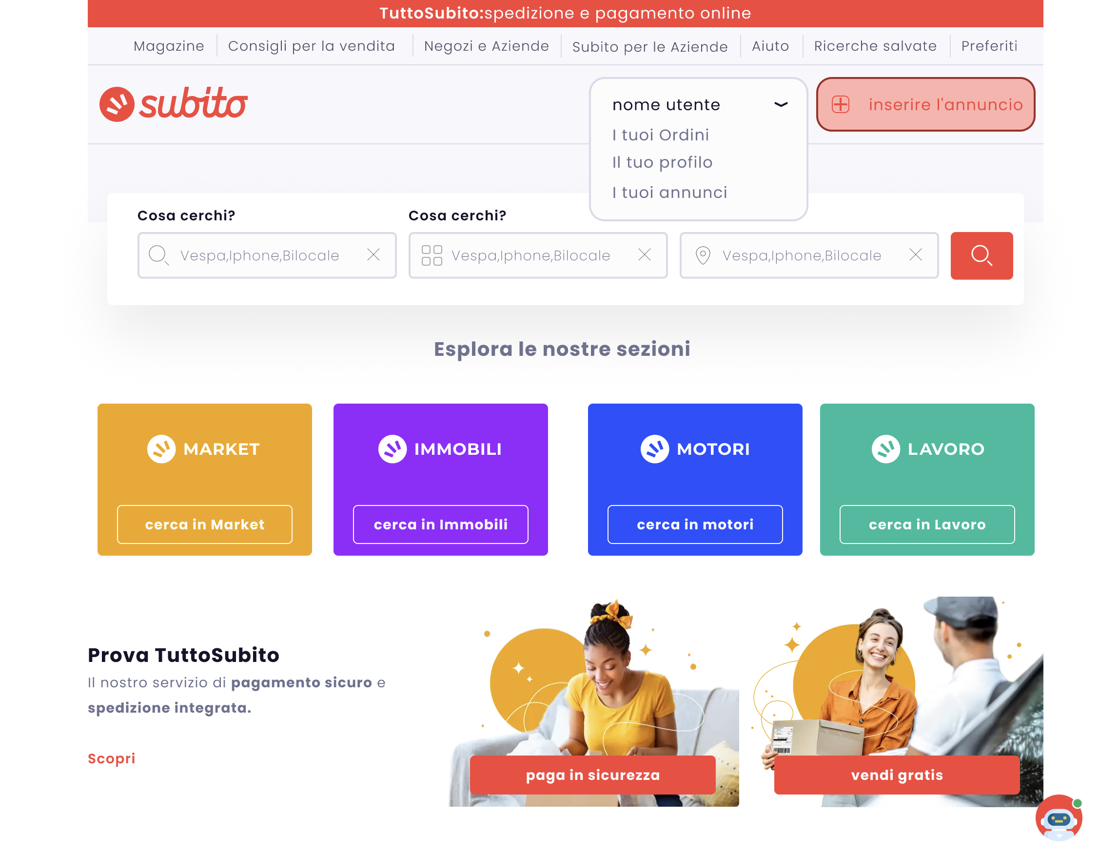
Subito is a fairly big deal in Italy. It’s the largest classifieds service in the nation and one of the most visited websites with more than 11 million active monthly visitors. They are members of the Adevinta company and among the ten most popular websites in Italy. Subito integrated payment and shipping services on its site in September 2021, which enhanced user engagement and resulted in more successful transactions. Because user 7 experience and “wellness” are a company’s top priorities and crucial to the long-term growth of their online community, Subito always carefully considers and places the potential effects of any innovations or diversifications in advertising and monetization at the center of its decision-making.
The objective of the research is to study user experience at a Subito website after the redesign, and how well the new design facilitates a positive user experience and a smooth online customer journey. The aim is to examine how web design affects perceived usability and UX. The objective for the case company is to gain insight into the usability of their new website and if the design supports their business objectives. To reach these objectives, this study aims to answer the following research questions:
The research question is:
Does the new design facilitate a good user experience and increase user satisfaction on the website?
The question will find out how the new website accomplishes to meet usability criteria and facilitate good UX, which will be analyzed from the cognitive walkthrough feedback. Also addresses the topic from a customer journey view and its purpose is to find out, does the new design indicate clearly what users can do on the website and how to accomplish their goals.
Questions of this project will be approached through theoretical and empirical research. As Subito company is one of the biggest e-commerce companies in Italy and they are constantly investing in their UI/UX design to improve the user experience, redesigning the 12 whole websites is not a good strategy because after many years existing of Subito e-commerce websites and having tons of users, it requires a great investment and having a set of expert designers to design a new website that improves user-experience.
The alternative strategy can be focused on defining those small and hidden pain points of users on the Subito website that is hurting user experience and probably by removing or adding some features on the website those pains can be diminished.
In a nutshell, this project aims to discover the possibility of improving user satisfaction by adding or removing some features on the Subito website.
Design Process
Overview
Designers create successful products when they know their users. There are different useful user research techniques and methods applicable to UX design. Each of them is based on the needs of a specific project. The aim of this project was to redesign the Subito website based on pain points that will be found during the design process.
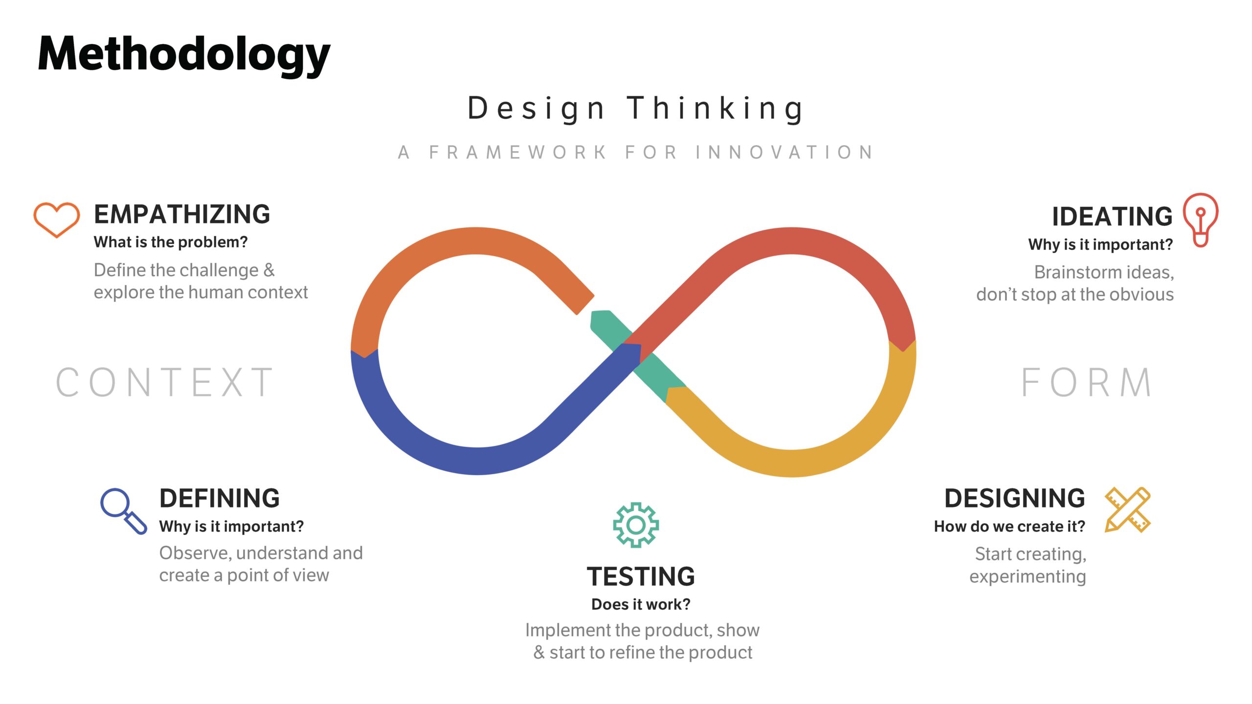
First of all, it was important to understand the business needs of the company. The Positive Communications team needed a website that could promote their business in the competitor market, and help to attract users, thus getting more traffic. Redesigning the website was based on a user-centered approach. I needed to gather information about the visitors’ opinions using the Positive Communications website. The design thinking method for this study was chosen which provides a good insight into possible usability problems that can cause damage to the user experience. As mentioned in the research objective part, by the following steps we were going to discover the possibility of improving user satisfaction by adding or removing some features on the Subito website.
Discovery Phase
The first stage of the design thinking process is to gain an empathic understanding of the problem we are trying to solve. Understanding the human point of view is crucial. This is when we go into detective mode to get to know the user and understand their desires, needs, and objectives when interacting with the Subito website. In this stage, quantitative and competitive research was implemented. Also, as an extra effort to find out real problems, several feedback from real users of Subito on the Trustpilot website was gathered to increase the accuracy of the research.
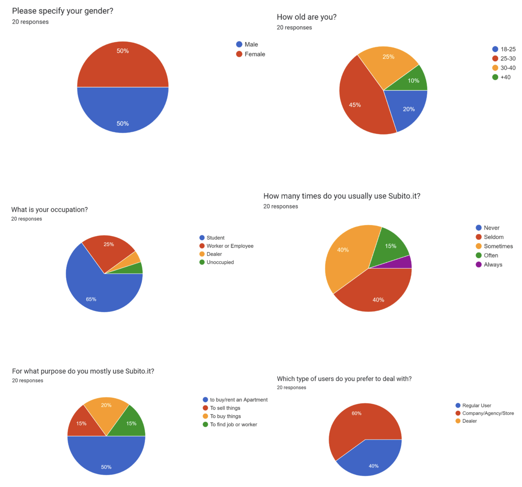
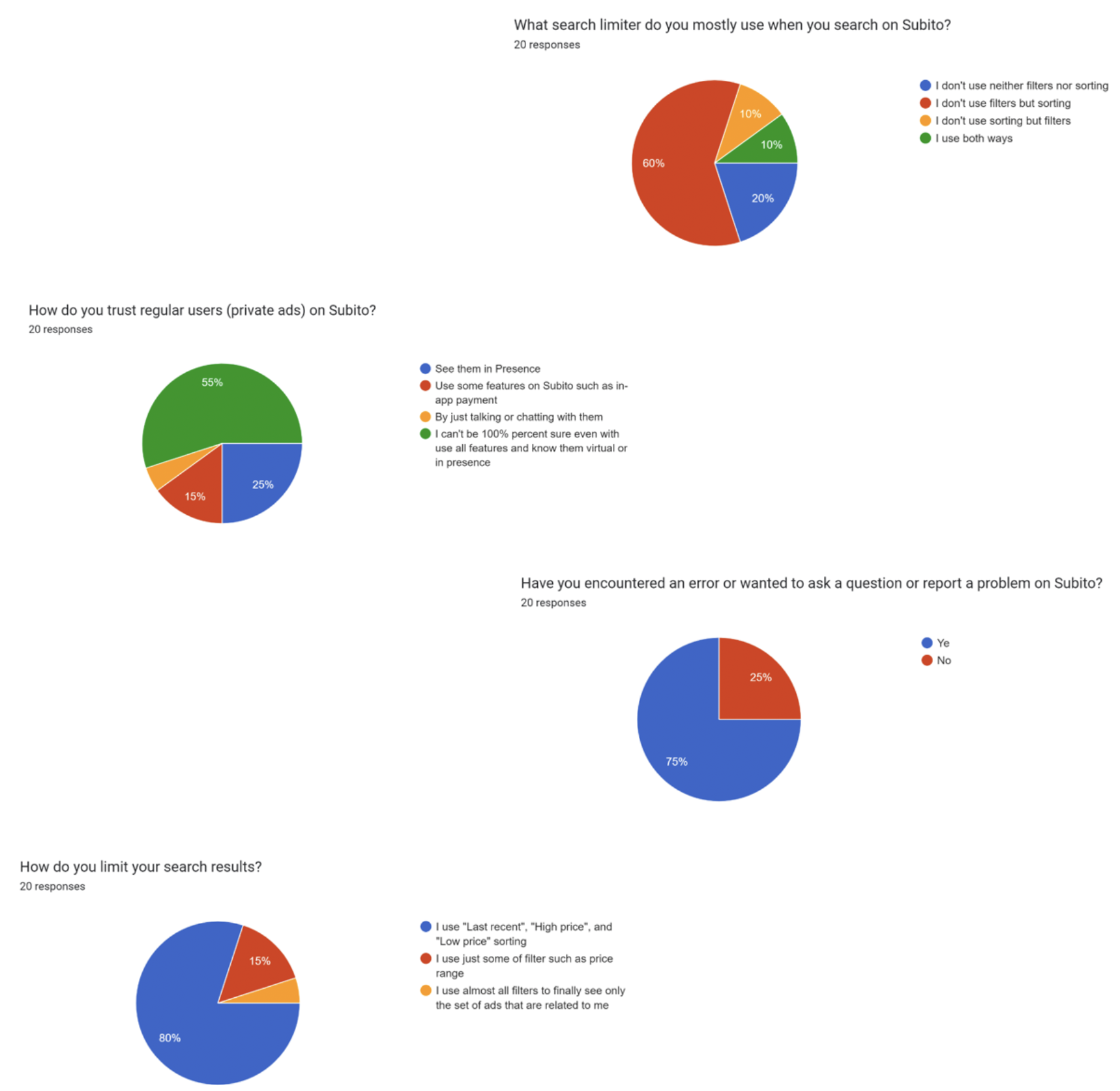
User research is used to understand the needs, behaviors, experiences, and motivations of the user using various qualitative and quantitative methods to be aware of the process of solving user problems. In this study, 20 participants were asked to take part in a survey with following questions:
• Please specify your gender.
• How old are you?
• What is your occupation?
• How many times do you usually use Subito.it?
• For what purpose do you mostly use Subito.it?
• Which type of users do you prefer to deal with?
• How do you trust regular users (private ads) on Subito?
• Have you had any bad experiences after finding a seller or buyer?
• What search limiter do you mostly use when you search on Subito?
• How do you limit your search results?
• Have you encountered an error or wanted to ask a question or report a problem on Subito?
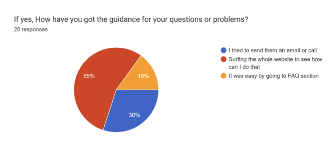
• If yes, How have you got the guidance for your questions or problems?
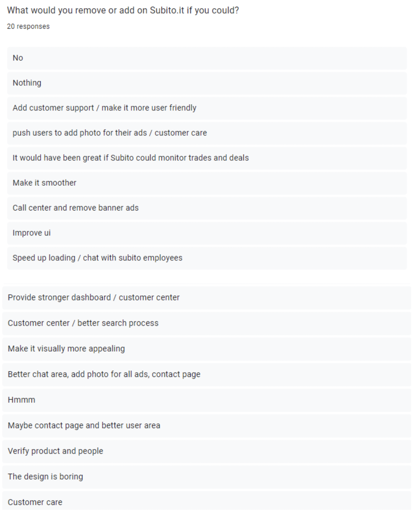
• What would you remove or add on Subito.it if you could?
Questions were organized to discover if they are comfortable with the existing key functions of the Subito website or if there is room for improvement, and eventually, the result was as follows:
To extent user research to see existing problems and pain points, some feedback from Trustpilot website have been gathered to conclude our user research analysis and have a big picture of all possible pain points.
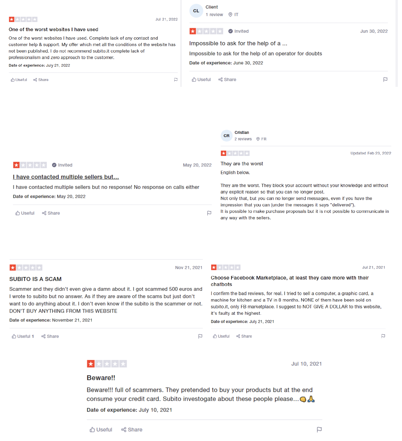
Source: https://www.trustpilot.com/review/www.subito.it
The outcome of user research mainly point out to some key insight:
- They prefer to get help from customer support services when they have problem instead going to FAQ section
- They need to be more certain that they won’t be scammed when they are dealing with some strangers
- They still have confusion through search process, they seldom use filters where Subito put some key features there
Competitor Analysis
We are not alone in the industry unless we are taking a particularly novel approach that aims to disrupt the market. However, that is not as bad as it seems. There is a pervasive misconception that in order to outpace your market competitors, we must provide customers with a brand-new, exclusive solution packed with cutting-edge technology and contemporary design. Most of the time, all we really need to succeed is to meet consumer demand and outperform your rivals slightly.
Building a product that people genuinely need and will be excited to use requires an understanding of the landscape of existing UX design solutions. In order to know who those competitors are and what value they add to the market, competitive analysis is a crucial tool. An overview of the competitive landscape will enable us to gain insightful information, pinpoint the strengths and weaknesses of our products, and create winning product strategies. A UX competitive analysis occurs during the research process when you look into every pertinent design solution offered by both direct and indirect competitors in your industry.
Based on the research conducted, various direct competitors were discovered for Subito. Out of these, I chose four who have been existing in the market, some of them for a long period of time. Strengths and weaknesses of these competitors have been reviewed to employ them as a data to promote some new features for Subito, as in the UI/UX design process, designers use benchmarking and competitive analysis to have some successful samples while keeping eye on the other competitors.
As mentioned before, here we discuss 4 active company’s website in this industry and review their strengths and weaknesses. Our approach for this analysis is both interviewing with some 51 experts and also observation directly through their websites. Ebay.it, Bakeca.it, automobile.it, and annunci.com were the most similar website to the Subito.
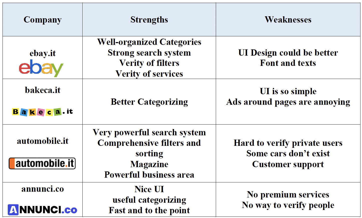
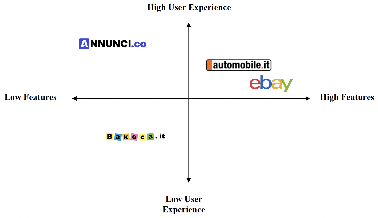
By reviewing these website, it can be seen some of them have many features and some of them do not offer any extra services and features, we know this is maybe because of business strategy but regardless of that still some features are so important while a website want to be active in this market. Here, based on what we observed from these platforms, we can have a perceptual map to understand better differences among them and visualize better correlation among user experience and features.
To have a comprehensive look at these four competitors we can not ignore the role of SEO of websites. This analysis can help us to understand SEO competitor’s website score in relation Subito website.
Define Phase
We need to identify the actual concerns or challenges users face in light of the analysis after gathering user thoughts, feedback, and issues. At this point, we should consider the user’s actions, thoughts, and requirements in addition to your company’s goal and the challenge we will face. By considering what users have said, done, thought, and felt, we can determine the primary issues and requirements. The Define stage will assist the design team in gathering excellent ideas to establish features, functions, and other elements to solve the current problem—or, at the very least, make it as simple as possible for actual users to solve problems on their own.
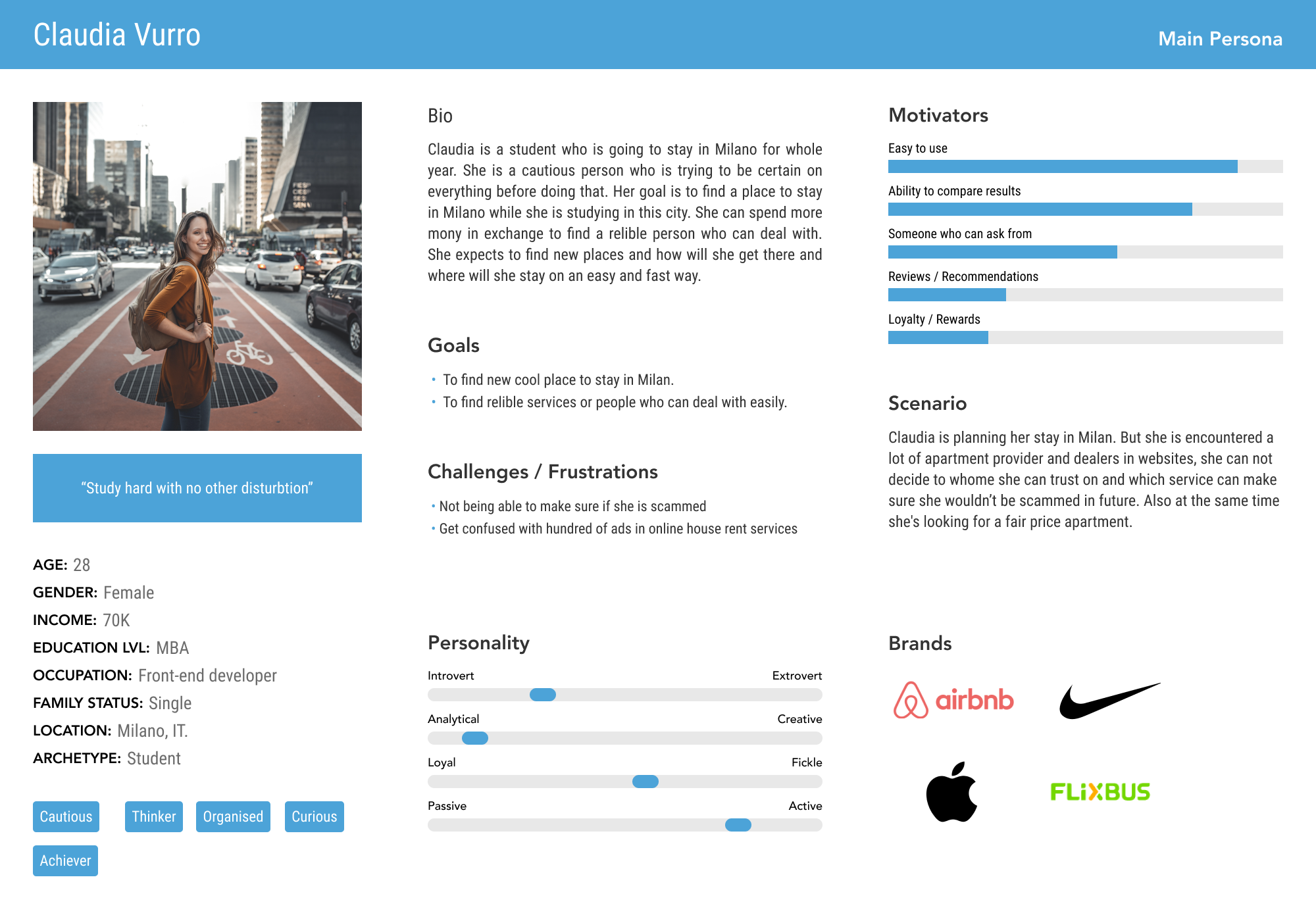
In this sense, considering previous part, the approach that was chosen for this part is to build a user persona and draw an empathy map to understand clearly user concern and problems 54 and then we have a clear problem statement, then we can proceed to the ideation phase to define our solutions. Here I drew up a user persona based the user researched conducted during previous stages.
Persona
User personas are archetypical users whose goals and characteristics represent the needs of a larger group of users. A persona is typically introduced in a one- or two-page document (like the one you can see in the example below). These one- to two-page summaries cover a persona’s goals, behavior patterns, skills, attitudes, background, and operating environment. Designers typically create user persona templates that include context-specific information (for example, for a banking app it makes sense to include a persona’s financial sophistication and major expenses) as well as a few fictional personal details to give the persona a realistic character (e.g. quotes of real users).
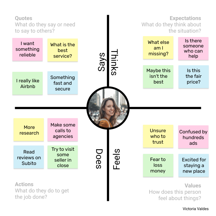
Empathy Map
We must prioritize their needs in addition to having a thorough understanding of our users in order to effectively advocate on their behalf. Empathy maps are a powerful, essential tool for achieving both, and are widely used in the agile and design communities. A collaborative visualization called an empathy map is used to explain what is known about a specific user type. It externalizes user knowledge to facilitate decision-making and to 1) foster a common understanding of user needs. Traditional empathy maps are split into 4 quadrants (Says, Thinks, Does, and Feels), with the user or persona in the middle. Empathy maps provide a glance into who a user is as a whole and are not chronological or sequential.
Our users are sophisticated people. It is commonplace to observe comparisons between the quadrants, which is very advantageous. We will also come across contradictions, such as a user’s seemingly positive actions but negative quotes or emotions. At this point, empathy maps transform into treasure maps that can unearth insights about our users. As UX experts, it is our responsibility to look into the conflict’s origin and find a solution. Considering that, I draw up an empathy map for our Subito users to better understand their emotions and thoughts.
Problem Statement
Subito website is a service with four main categories as: vehicles, jobs, real estate, and market. The structure of the site will be discussed later only in those areas that our users have more problem. Word of mouth is seen as an important way of increasing the number of customers. Reliable purchase, competitive price, and satisfying customer service are the three main contributions for people to recommend an online shop to their friends. This claim also support our output from empathizing and defining phases, as our users are specifically in real estate category on Subito website and they need more trust, less confusion and more support by company at least to guide them sometimes.
As conclusion to our pain points gathered during previous phases, I can list them here:
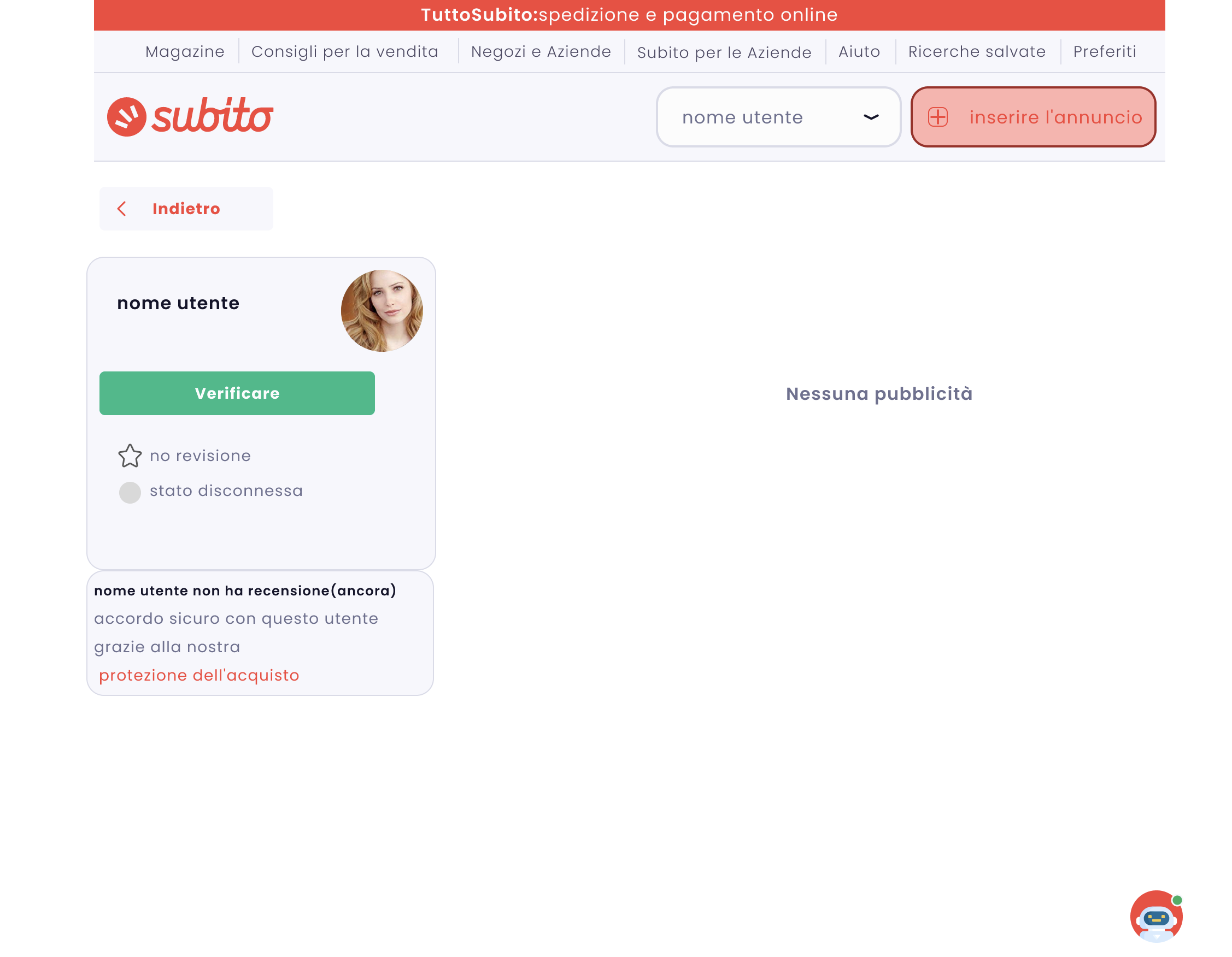
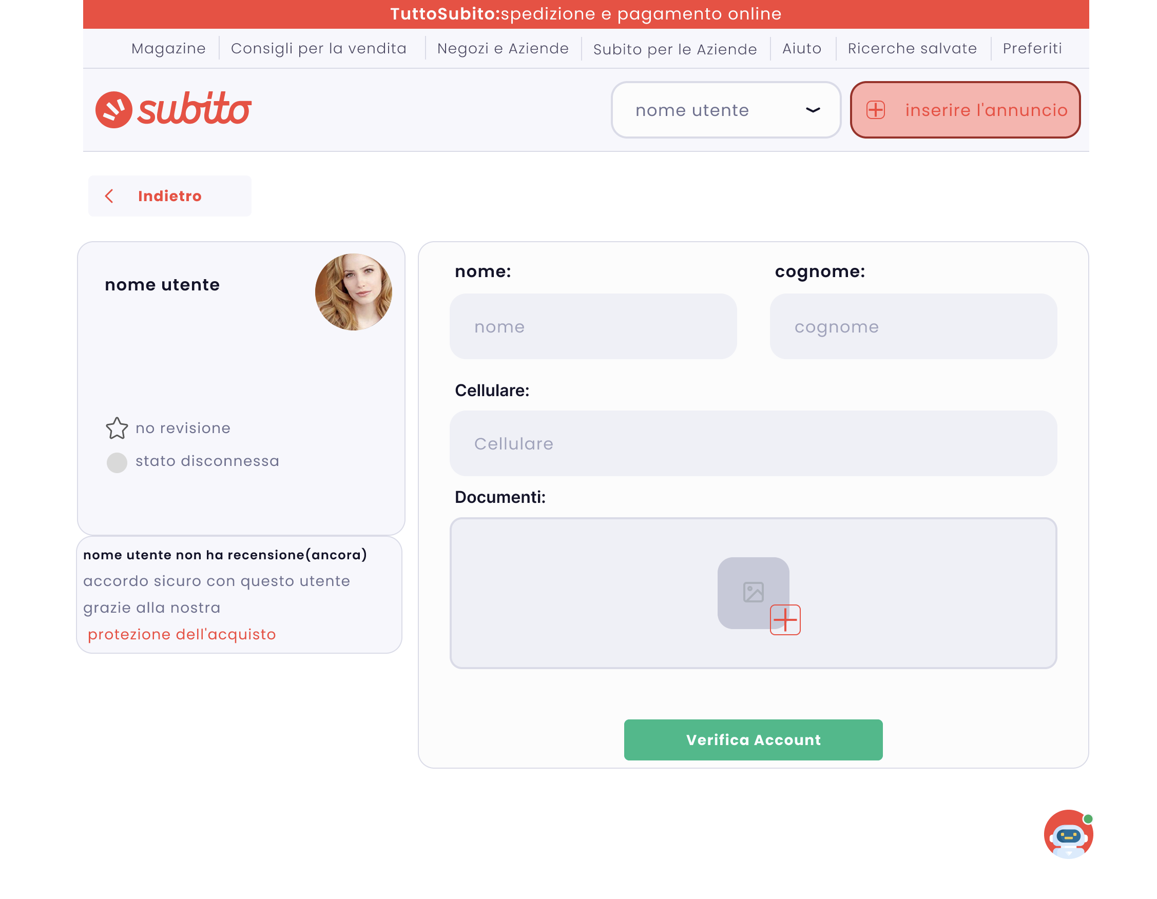
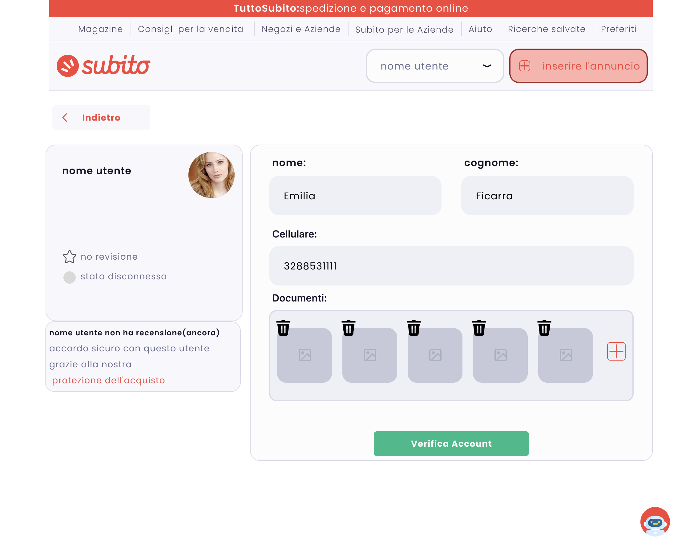
- They simply need that Subito can verify people and distinguish real people from scammers.
- They need customer support service or a chat area where they can communicate with agents.
- They need to access quicker to reliable people or companies and have less confusion when they are looking for what they need, in other words, they need access quickly to results only for new products and those products and services offered only by agencies and companies.
Ideate Phase
Let’s quickly review the five stages of design thinking, empathise, define, ideate, prototype, and test, before delving deeper into ideation. It’s crucial to keep in mind that the process of Design Thinking is not purely linear. But an effective ideation session will be guided and informed by the conclusions and results from the Empathise and Define stages (getting to know your users and articulating a clear problem statement). Ideation is “the process of generating a broad range of ideas on a given topic, with no attempt to judge or evaluate them,” according to the Nielsen Norman Group.
Current Solutions of Subito
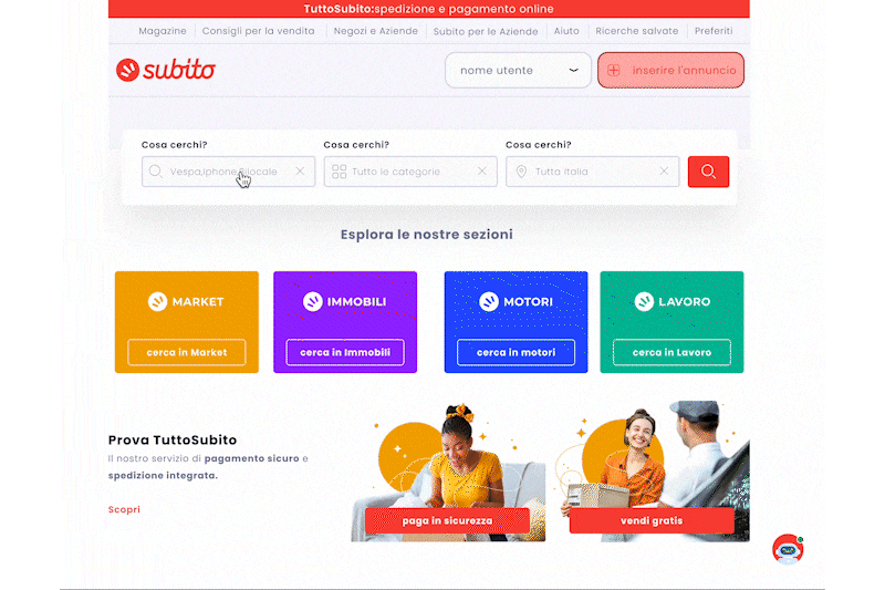
As some pain points have been mentioned, I want also to point out that Subito already knew these paint points and implemented their solutions and we should look at them to find out what are and why they do not work for users. We mentioned that users still have confusion to access quicker to trusted ads posters. But who are trusted ad posters? Subito now accepts agencies and dealers in Tuttosubito service, and via this service, they can have their own virtual store subito with all premium features including secure payment, delivery by subito, and customer care. But users just can use filters to differentiate them into search results as below:
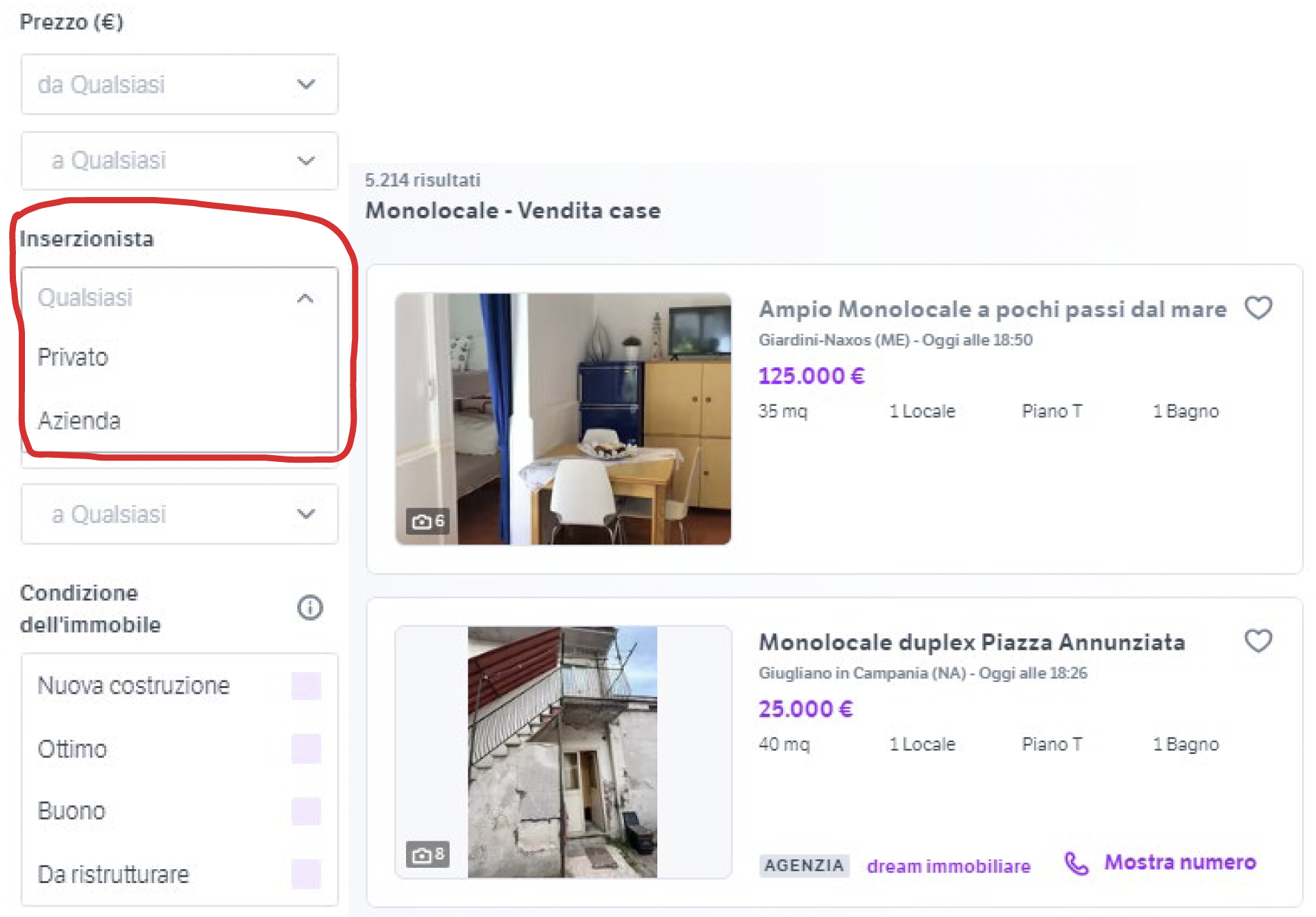
When users click on this filter, the result shows only for selected results. As usually agencies and companies are secure providers in subito it is important to improve user experience for this section. In addition, based on our research, there are less people who tend to use filters at the beginning, people tend to use more sorting and do not want to look at a long filter list at first, this is where we should come up with idea about redirecting users to access to trusted seller quicker than filters. Also, Subito uses reviewing system for all users and sellers by which if a sellers have done their first sale then they may be given a first review from 0 to 5 stars. In this way, users can trust more on ad posters with more rate.
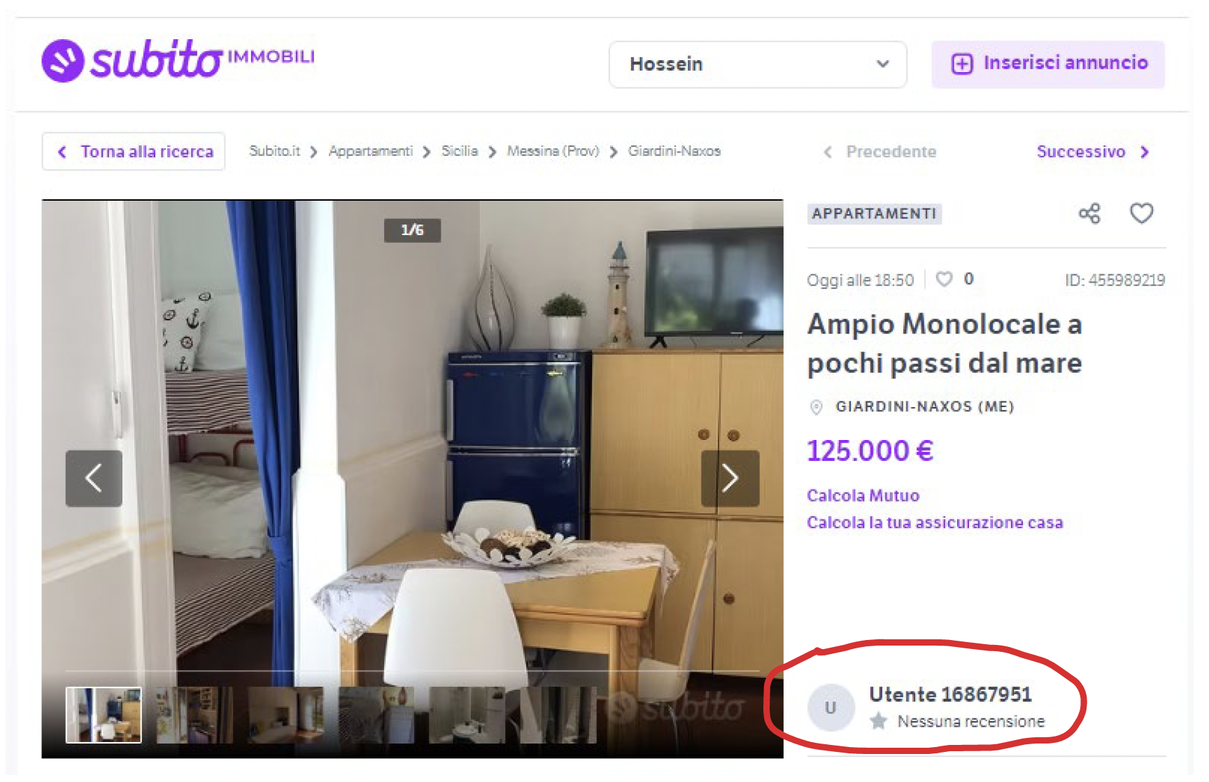
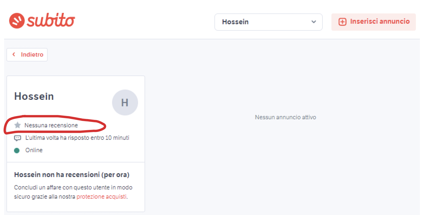
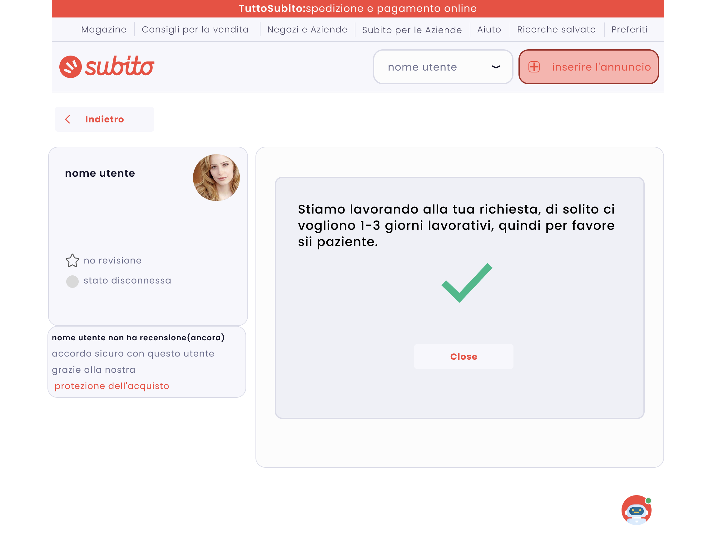
The biggest problem of this solution was that many of ad posters use Subito just for a couple of times and not more and then they would not get stars. This approach may work for Amazon or online shops in which real stores can continuously sell their products on the website and there is a high probability of getting reviews by clients, but in ad posting services it may not work for most of the ad posters and we see most of them without any reviews and rates, and this 60 is where we should intervene and with new feature, people can decide if job poster is a real and verified person or just a scammer.
Another pain point was about the customer care system for regular users (not people who are trying Tuttosubito service). As it could be completely understood from Subito’s strategy, they do not want to get stuck in between of job posters and users because there might happen a lot of things here and Subito sometimes can not do anything, especially in order to fraud. Subito also wants to promote Tuttosubito offer and attract people to use this service and in this sense they are doing right things. But the problem is that they should not leave regular users alone when problems arise, even though they answer most of problems and questions on FAQ page, how ever people usually find FAQ sections confusing and people tend to call with customer care, this is where we should offer something that lead users to the answer they are looking for. Here also you can see Subito is suffering from their customer care system. They can not handle even with Tuttosubito service and this is because maybe most of problems happen when buyers do not have enough information about how to deal with and how to avoind being scammed.
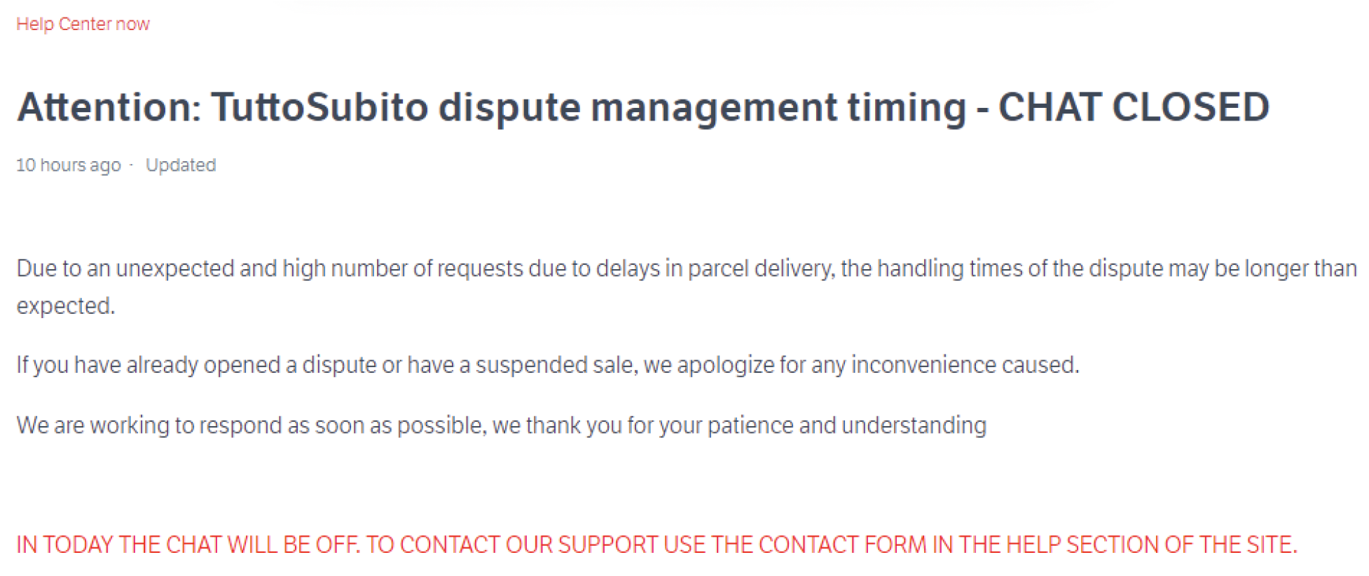
Subito announcement screenshot
User Journey
A journey map is a diagram that shows the steps someone takes to complete a task. In its most basic form, journey mapping begins by creating a timeline from a series of user actions. After that, user thoughts and feelings are added to the timeline in order to build a narrative. This story has been streamlined and compressed, and it ends with a visualization. In this sense, I created a user journey map for our persona as follows.
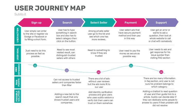
The solutions of current problems as alternatives of Subito solutions were mentioned here.
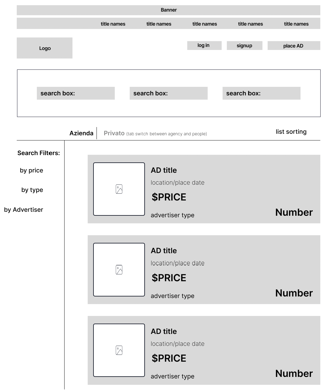
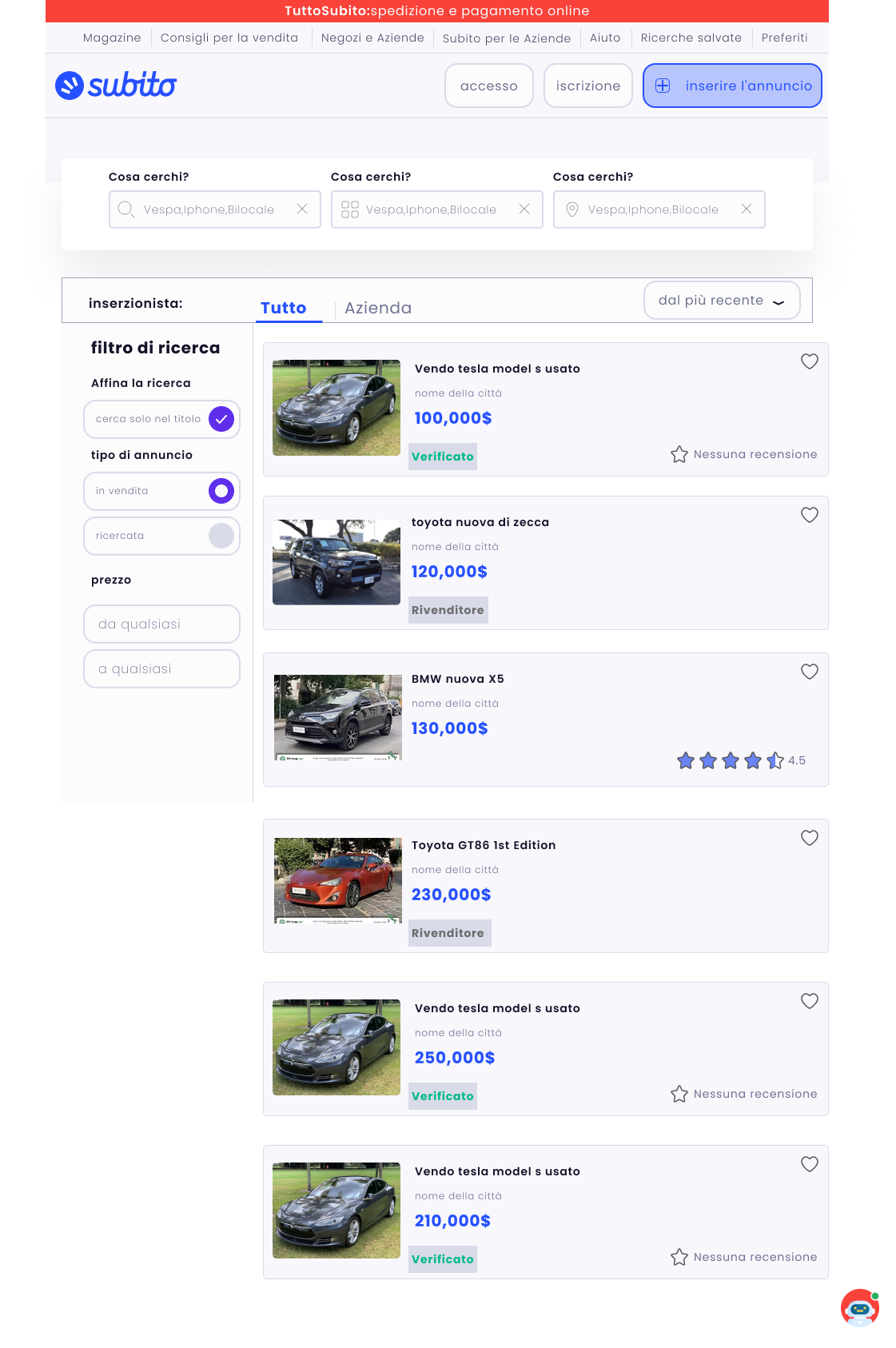
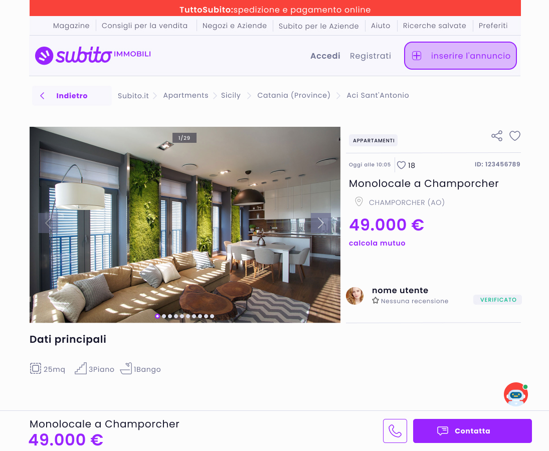
• A tab should be added to search result as a new discovery section to show just only agencies and dealers. This is a modern way for easing accessing users to the search results.
• For regular users we should have a different verification process as other famous websites do. They at least can verify the identity of their users and prevent many scammers in this way.
• Adding a chatbot by which an artificial intelligence-powered can analyze user’s questions and redirect them at least to the existing article. This process can save a lot time of for users in going to the FAQ section and finding their answers. Most of the time, users can not sure which category of questions their problems belong to, though, this solution can improve their user experience.
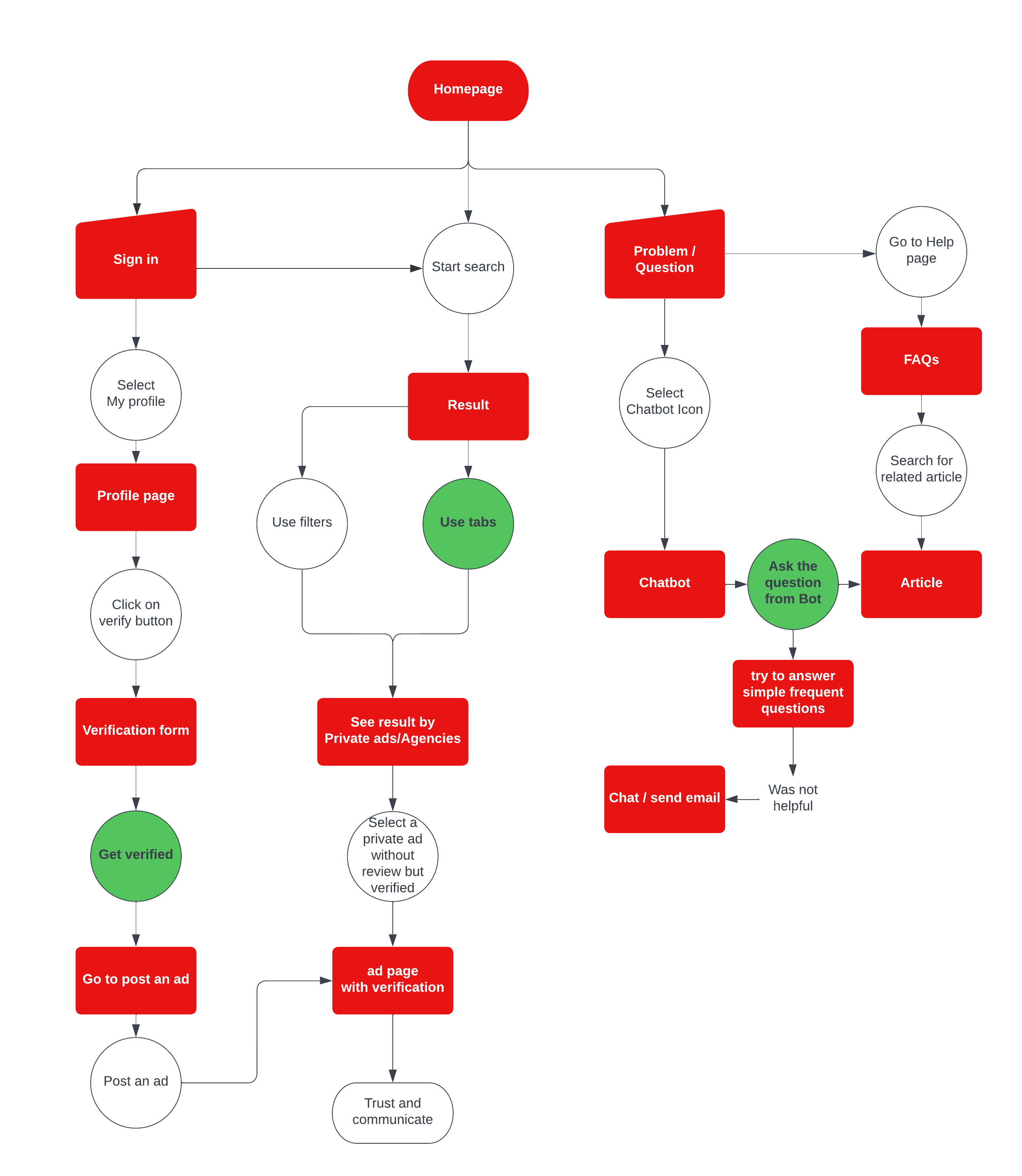
User Flow
In the prepared user flow for this study, I used the ideas from previous phases to create a user flow from the start point. We have three different route to solve the problems and in which I distinguished nodes by action and page/feature.
Design Phase
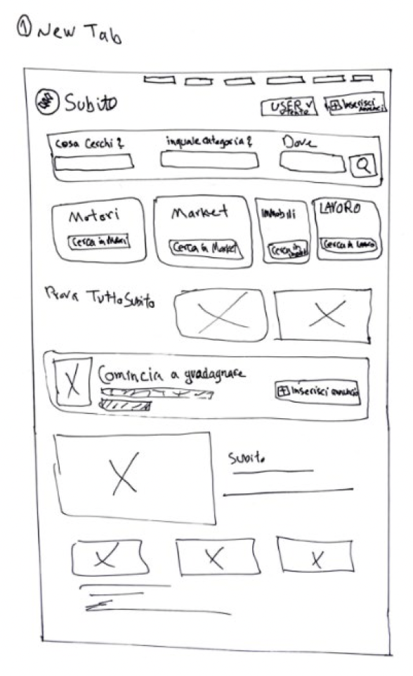
In this fourth step which is all about experimentation: transforming ideas into tangible “artifacts.” we are working on our ideas to make them life, to see how they look in the real. Regardless of the task at hand, rapid iteration and even prototyping is a crucial step here. There are many different techniques from sketching to high-fidelity design and then prototyping. We are at one of the most crucial steps which involves visualizing the skeleton of the website, though, some important steps will be considered for this phase from paper sketching to high-fidelity design.
Sketching
Sketching is a fast and efficient way to visualize our ideas. we don not need to be a skilled artist to create sketches. As long as we can draw boxes and arrows, we can communicate our ideas to other people. Using ideas from user flow step, I draw up some sketches from our new features.
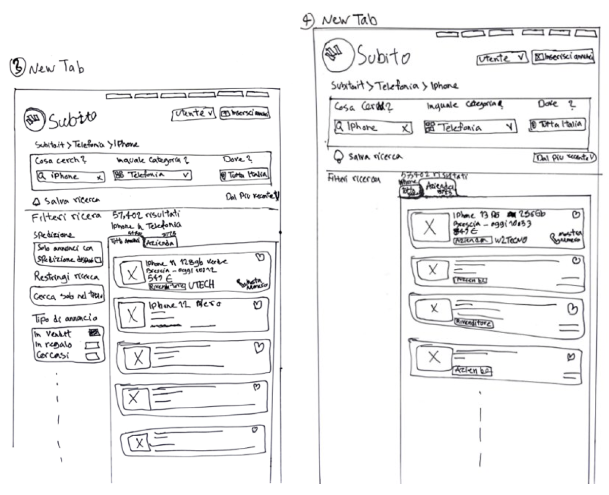
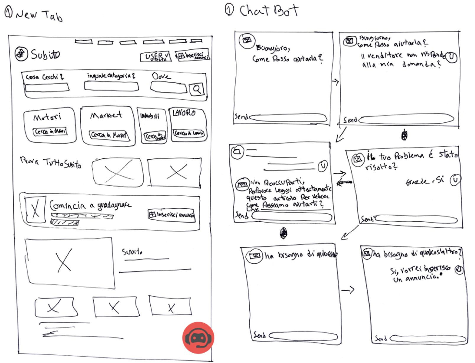
Wireframing
When using the Design Thinking Process, a wireframe is typically a monochromatic drawing that is produced during the design phase. It offers a detailed description of the page’s layout, information, and features. As a result, the stakeholders have a clear understanding of how the application UI works and is represented visually. Here based on sketches from the previous step I started to design wireframes to show key features that will be added to the new design. Wireframes only will show the main process of each feature, for example, for designing new face in wireframe I only drafted a look from a possible search result page in new design format.
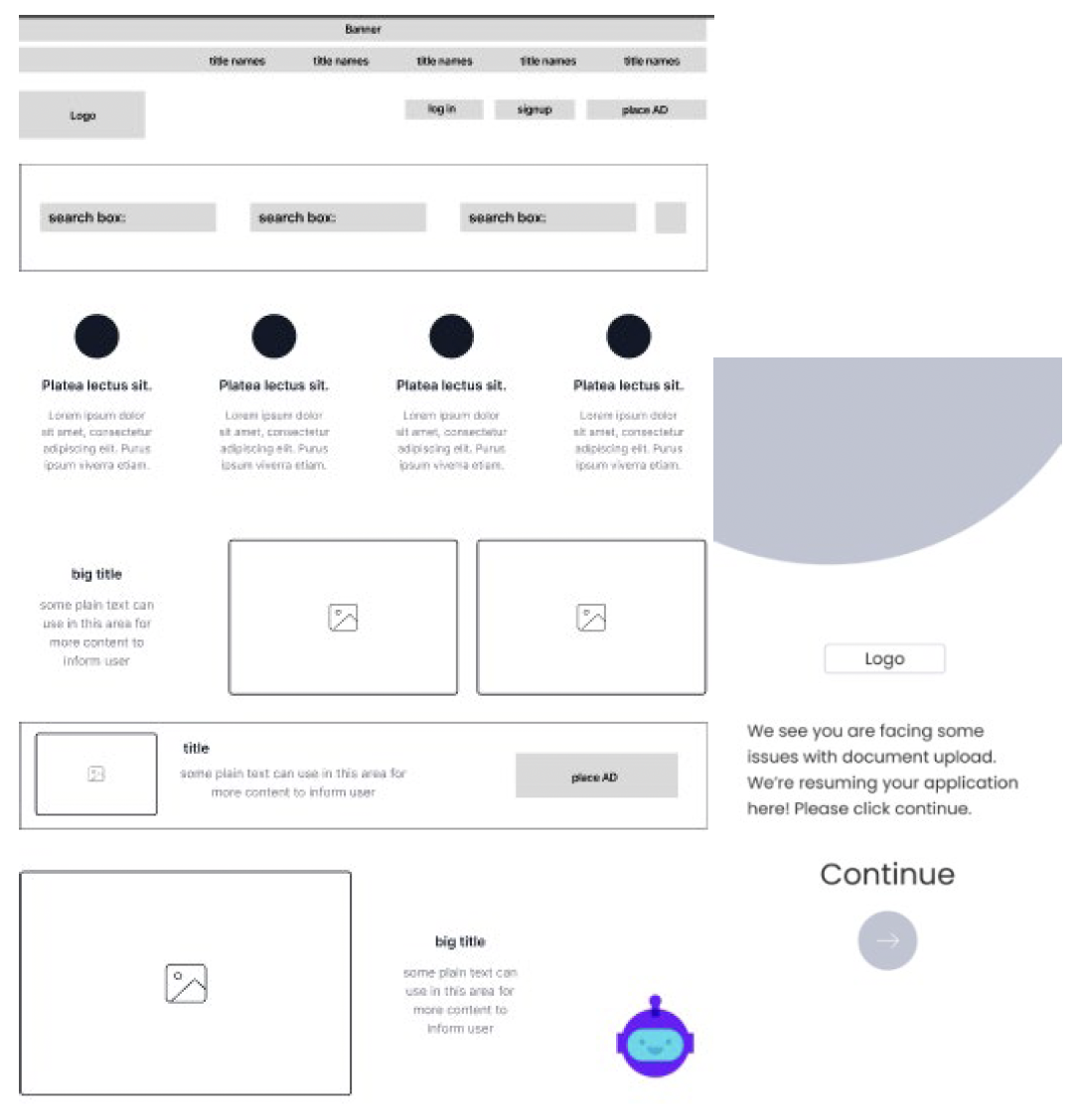
High fidelity
design I started with high-fidelity design because Prototypes with high-fidelity interactivity have realistic (faster) system responses during the test. When a product is high-fidelity prototyped, it starts to take shape. Designers can produce hi-fi prototypes that look and function as closely to the finished product as possible by using mockups with color and content.
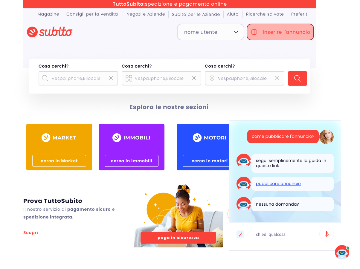
In this scenario, our approach is to decrease the confusion of customers by putting an artificial intelligence-powered chatbot to lead the users to get more information about their problems. For example, if they are looking for information about how to post an ad or what are the rules for posting an ad, they just need to simply ask it in the chatbot area then it will guide them to the right article. Subito can use this function for getting information to users who have more personalized questions and questions that are rarely asked, if their user experience in this way can be enhanced then we can say we were able to mitigate the pain of users for this problem. For the next feature which is about adding a function to search results by which users can access quicker to trusted sellers, based on the wireframe I created a flow in which the user after searching a keyword can see the separate result in two tabs as following:
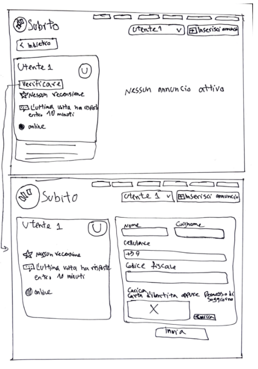
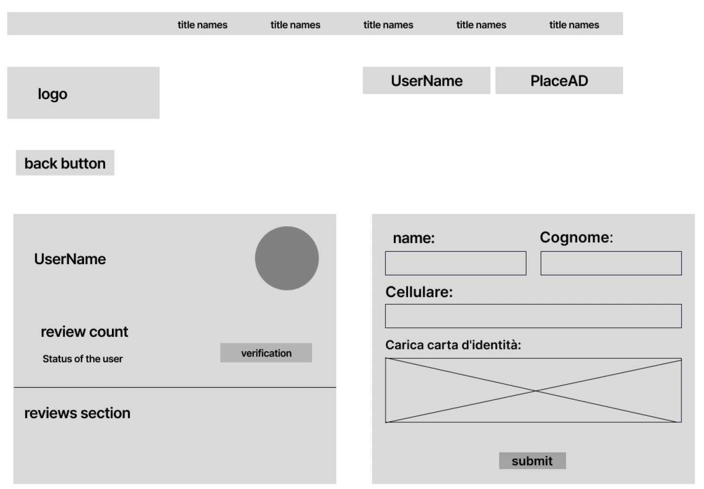
The other feature would be verifying regular users (private) because there are a lot of ad posters who rarely use Subito hence, they cannot get reviews and ratings to verify themselves. Subito should handle this issue with at least a simple identity verification. As ad poster should go to the user-reserved area and there will find a button for verification by which they can verify their identity as a real job poster. Subito also can ask for proof documents about owning that asset. In this sense, ad posters can differentiate themselves by getting verification, and as a result, more users can trust them.
Test Phase
Prototyping and testing have a significant positive impact on the design process. User testing not only enables us to stay user-centric, but it also makes sound business sense. We are able to find design errors and usability problems before we launch the product by frequently and early testing our ideas. For us, the user, as well as the company, this has a ton of advantages. The core principle of design thinking is to prioritize the user and we can make wise design decisions and ultimately increase user satisfaction by getting direct user feedback. Prototyping and testing will help designers maintain a constant user-centered perspective. Users who are happy are good for business. As we can see, testing and prototyping are beneficial to all parties. For this study, I will use usability testing first to see how our prototype work in real and how our potential users will react.
Usability Testing
The next step is to have users interact with the app, watch their reactions, and then ask for their feedback to further improve the product. This was done to test the app’s effectiveness. This initial usability study aimed to determine how well the initial meeting process interface design supported and to get input on any additional features required. For this session, 10 users were asked to test our prototype and see then ask questions. Our design is in the early stages and can improve itself, however, for testing sessions, it is quite good and can transfer the concept of adding new features to the Subito website. In our clickable prototype, as you can see below screen, there is a main flow starting with the homepage, then users can decide which flow he/she want to go through among 3 features called Chatbot, Verification, and new discovery mode, then users can go back to the first stage by clicking on the logo.
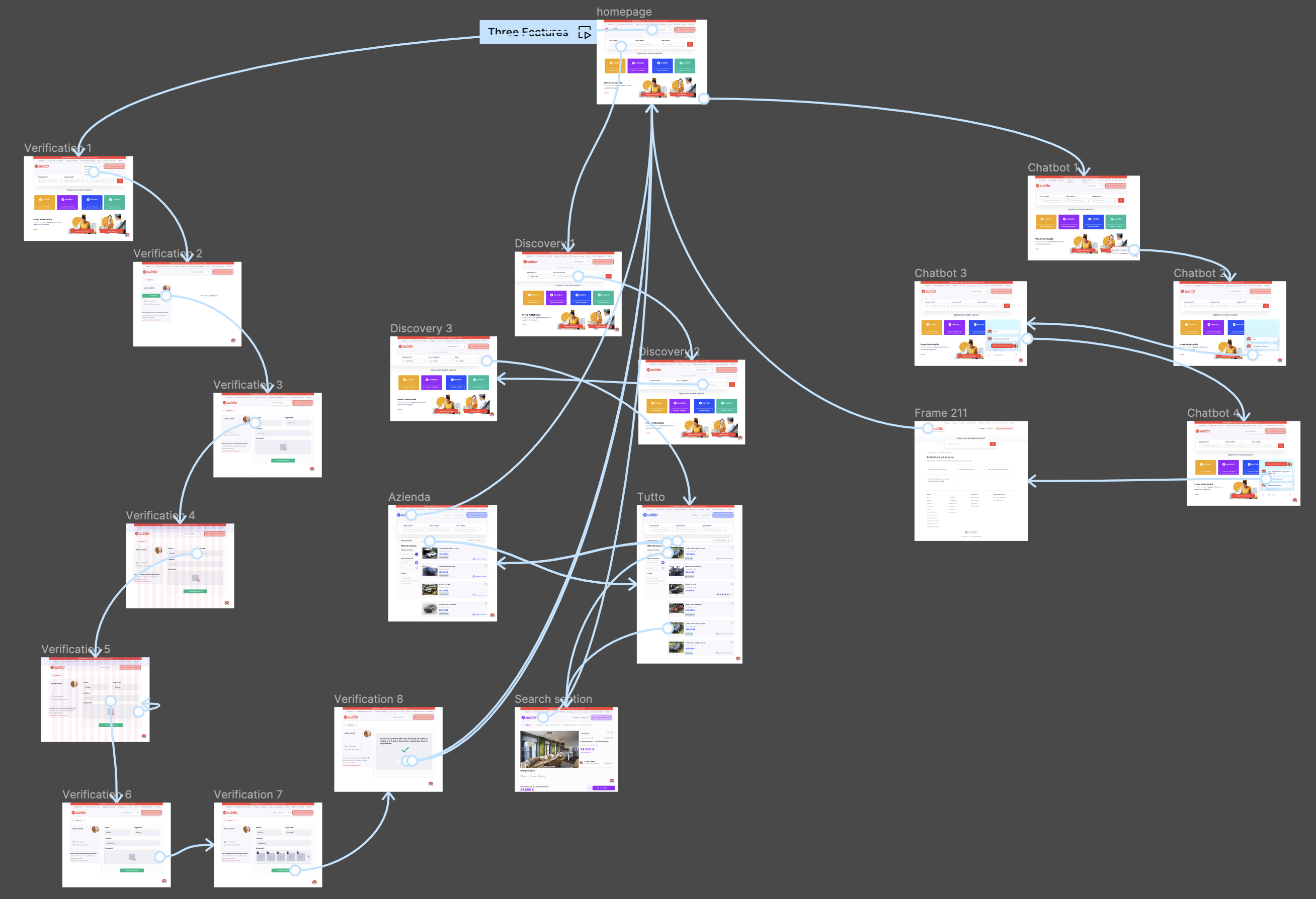
Clickable prototype:
https://www.figma.com/proto/lCdJeqgazKZ3CCOOFKWkAL/Subito-ReDesign-main?node-id=267-2537&scaling=min-zoom&starting-point-node-id=267%3A2537
Survey
For the final data collection, a user test was conducted and 10 test persons were involved. After the testing session, they were asked to answer multiple questions and also one open question at the end.
The questions were asked:
- How satisfied are you with the new features? (rating from 1 to 10)
- Can the chatbot feature decrease your confusion about your problem?
- Do you think the new discovery mode helped you to find trusted sellers quicker?
- Do you think a new verification feature would help you to deal with an unrated seller with more confidence?
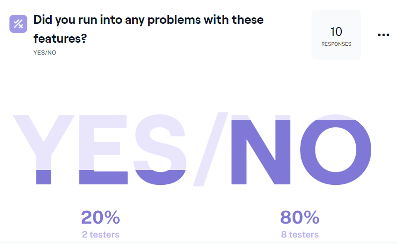
- Did you run into any problems with these features?
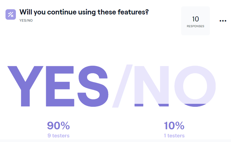
- Will you continue using these features?
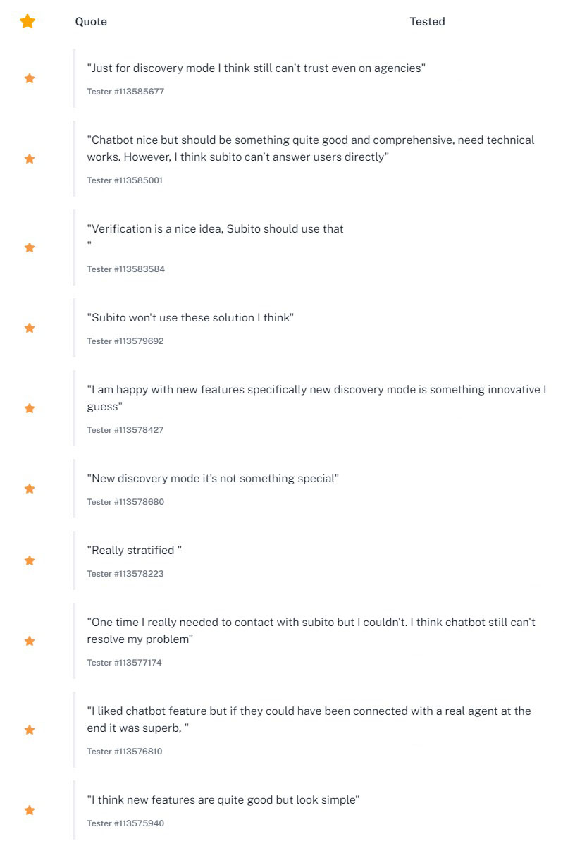
- Do you have any thoughts or feedback on these features?
Results
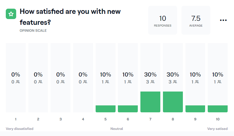
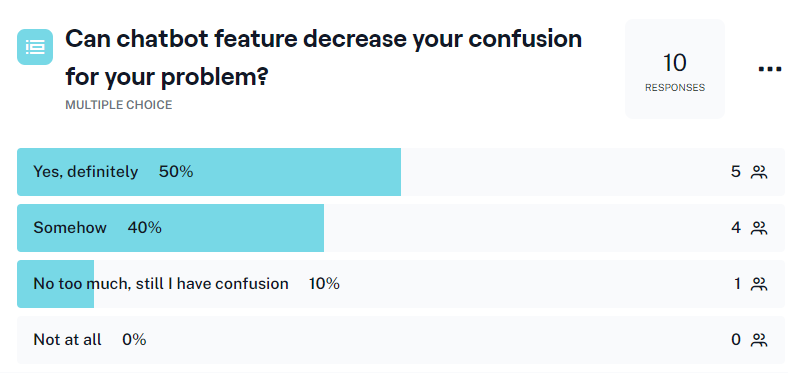
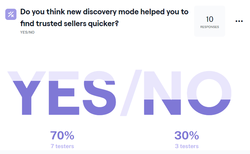
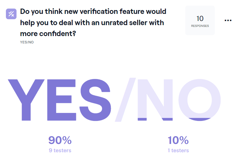
The results of the questionnaire are shown before for all 7 questions. For the first question testers tend to rate more than average mostly from 7 to 8 and not less than 5 no one got to this question. The second question was about chatbots 5 testers think this feature can reduce confusion and 4 think this feature can be helpful “somehow”. The third question was about the verification feature and the tester was asked to respond yes or no if they think this new feature can help them to trust more ad posters and surprisingly all of them were certain it can completely be helpful. The next question was about the new discovery mode where users can see result in two different tabs, one for all ads and one just for agencies and dealers, and 70% of testers think they can access quicker to trusted ad posters (agencies). The fifth question was asked to understand if something is missing or seems to be odd or wrong during the test session, this could help me to find out if I made a mistake in creating a prototype or design process, and 80% of testers selected “No”. The sixth multiple question asked this question that if they would continue using these features if Subito add them on the website and 90% of testers selected “Yes”. The last question was an open question about their other feedback and opinion about these features and as results show most testers are happy with new features and some of them are skeptical that Subito would use these features on their website in real.
Conclusion
Considering research objectives, one potential weakness of this study is that it involved few participants. The final tests included 10 participants, which is far from enough to generalize the results. Related to this is the fact that the participants had to evaluate both versions and even though the order was randomized, it could still be a source of bias. However, the results were still clearly positive, pointing to the potential advantages of following clear and well-supported interaction design guidelines. The problems of users shown during this study are being solved by the current solutions by Subito that have been addressed. Those solutions were discussed but they have been creating numerous frustrations and confusion for the customers. Therefore, the brand has been facing the problem of satisfying customers and losing customers and credibility. The new features presented by this study, on the other hand, would have solved the critical problems above by meeting customers’ expectations and gaining their trust. From the business point of view, we know all we need to do is to keep customers within us throughout the customer journey. If they leave us in each step we will lose a potential customer who could buy our product and service more and more. Attracting customers to a business is something hard, but the harder thing is to keep them and make them loyal to our brand and this would not be gained unless we provide them with a pleasant user experience while they are on our website.
Generally, people leave the e-commerce 77 website if they find them unrelated, unconfident, or useless, through the process we did during all steps from user research to test, I understood that Subito users still have confusion and feel unsafe dealing with strangers. As a consequence, I presented three solutions and tested them through usability testing and then made a survey in which our users were satisfied and wanted to have these features on Subito. All companies have their business strategies that sometimes can affect user experience on the website, in this study I tried to consider Subito’s strategies, for example staying away from getting in touch with all customers and do not provide online customer support. In this sense, all of these features were designed in line with Subito strategies and they can use them to increase their user satisfaction. I also can suggest further studies to keep working on trust issues on the Subito website where most problems arise from there.